Blu Box
One of our recent projects
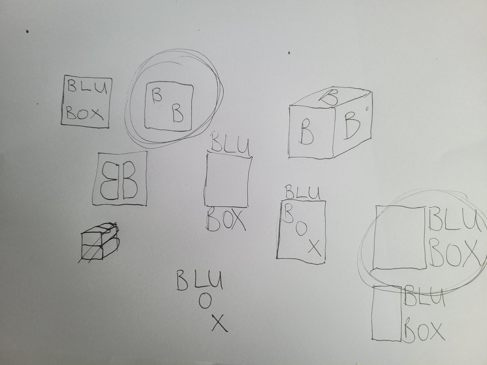
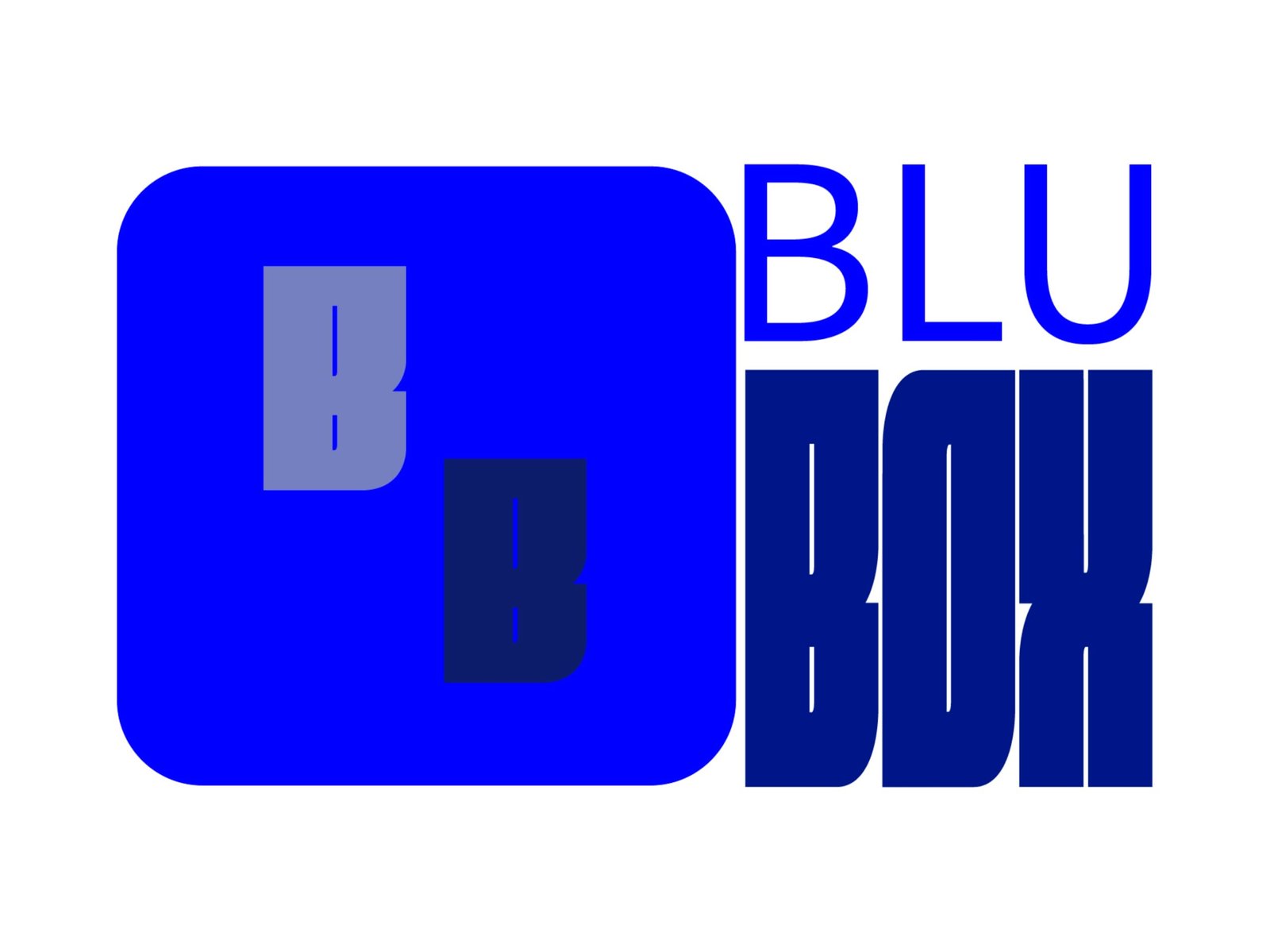
We were approached by Blu Box, a start up business in the self storage industry. The brief was to design a logo and icon that was simple and easily recognisable in their local area.
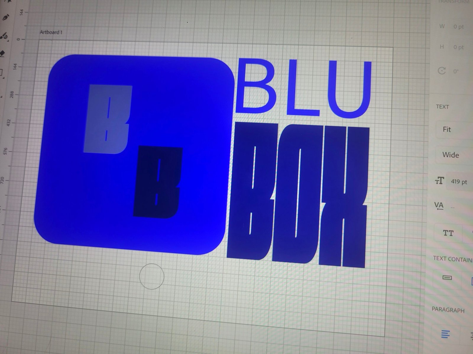
With a name like Blu Box, a lot of our design was obvious. We started with a quick sketching session and the square box icon fitted the brief. A colour pallet of blues that were complementary was decided on and fonts that were unique but easily read. In particular we were pleased with the BOX font creating a square.
With the BOX text being square, the icon needed to be rounded to avoid a conflicting square and tie the icon back into the BLU text.